Logo design: cases of success and failure
Within the entity of a trademark there is any sign or means susceptible of graphic representation that serves to distinguish that trademark and its products or services in the market. Among these representations is the logo, the visual part of the trademark.
When registering a trademark and starting to outline its strategy, the logo design is one of the basic pillars, present in all the marketing actions to be carried out. It is also one of the first elements to which the consumer’s mind goes when he/she thinks of the brand.
The main characteristic of a logo is that it has to be easy to remember, and at the same time it gives the audience an idea of what the brand means. But, sometimes, brands do not take these objectives into account, and they have not had a positive experience in their design and in the consumers’ response.
In this post we will review some cases of success and failure in the design of logos of well-known brands.
Logo design cases of success and failure
Success cases
FEDEX
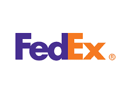
The purple and orange color combination excites everyone, but it’s so much more. The arrow hidden between the “E” and the “X” symbolizes speed and trust in the company. Simple and with a double meaning that expresses the brand’s objective.
PIXAR
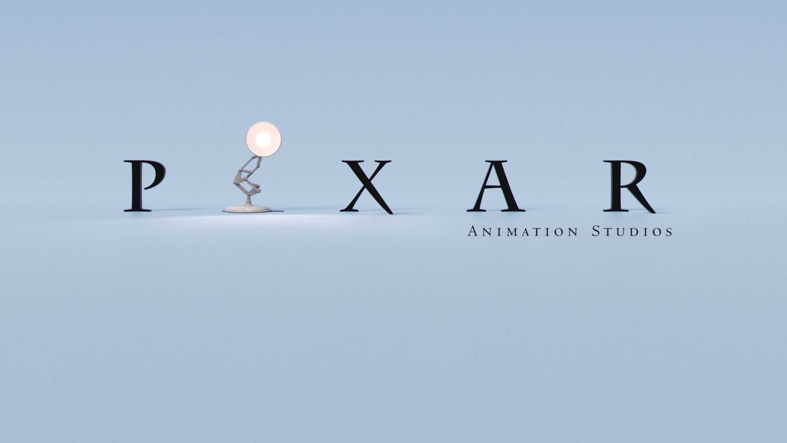
The famous Pixar logo can be seen at the beginning of each of the studio’s movies, an animation in itself that has already become an unforgettable experience, with that lamp that resembles the letter “I”.
Failure cases
PEPSI
Coca-Cola’s competitor, Pepsi, changed its logo in 2008, which brought criticism from consumers. Its three lines of red, white and blue colors were no longer parallel, and comments soon followed when the rounded figure of the logo was compared to a fat man. The brand’s association with obesity, however small the repercussions, was a bad image for the brand.
STARBUCKS
In 2011, the Starbucks coffee shop chain redesigned its logo, eliminating the text it had always included, “Starbucks Coffee”, accompanying the drawing of a mermaid with two tails. For those unfamiliar with the brand, the text helped to understand what it was all about. It can be a mistake for even large chains to assume that everyone will know them or what they want to convey with their brand logo.
Changing your company’s logo means a new company image. It is a very important decision that should not be taken lightly, since it will allow positioning the company.
At Lidermark we are specialists in the registration of trademarks and patents, in addition to industrial design. You can contact us to know the whole procedure of how to register trademarks.


Leave A Comment